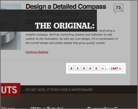
Here’s a lovely pagination control I looked at on PSDTUTS today. Actually, first I used it; when it took me to a page I was not expecting, I hit the Back button and looked at it.

It’s a testament to both my arrogance and my compulsiveness that I found five things I could “fix” about this control before I went back to whatever I was doing.
Diagnosing it
Now, I’m going to treat these as though they’re improvements, but you may think some of these suggestions are bad — or, at best, merit‐neutral. I never said I was good at this.
But here’s where I would start.

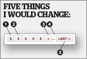
- This is what the “current page” style looks like; it’s also the hover state for each of these buttons. To me this isn’t enough contrast between the current page and the rest. The page you’re on shouldn’t look like a button.
- The normal state of this button is brighter than the hover state. The hover state uses a slightly darker background and gray text instead of red. I’d reverse this — save the red text for the hover state.
- This is probably the button you want. It’s the button I wanted. It’s the “next page” button, but it doesn’t say “next” on it; it just has two faint chevrons that look like tiny arrows, even though they’re not. (They’re angle quotation marks; they’re used in some languages instead of the quotation marks we use in English.) This is the most important button in the group, but it’s got the weakest presence.
- The ellipsis needs more room to breathe here. Also, it makes sense to put the ellipsis between the number buttons and the “last” button, but it doesn’t make sense to put “next” on one side and “last” on the other. This suggests that something is being left out between those two, but what’s been omitted is everything from six to the end.
- The most worthless button is the largest and invites mis‐clicking. “Last” is far less useful than “next,” so why is it the largest, and why is it placed on the end?
Wait! Cancel the ordered list. I’ve got to make this into a section.
Aside: I hate “last” and wish it would go away
In this example, we’re on page 1 of the list. Knowing nothing about the user, which page is she likely to choose next?
Obviously 2 is most likely. I’d say 3 is next most likely, though far behind 2, and 4 would follow in the same suit.
But where does “last” fit into all this? In a chronological listing like this one, “last” would take us to the earliest entries in time — it’d reverse the sorting, in a way, letting you paginate backward while traveling forward in time.
In blogs and forums, for which freshness is paramount, there’s little use for wanting to see the oldest items. Or consider a list of YouTube videos sorted by popularity, or WordPress plugins sorted by rating. What self‐hating soul would opt to see those items judged the worst of the worst?
I might not be a representative sample, but I have clicked on a “last” button by accident at least ten times more often than I have clicked on a “last” button on purpose.
Fixing it
Despite the rage‐fest, I’m going to let “last” stay on screen — but only if it accepts a massive cut in size and stature.
But I’m going to start from the outside in. “Next” and “previous” will get top billing; the current page number will play a supporting role; and all other numbers will play bit parts.
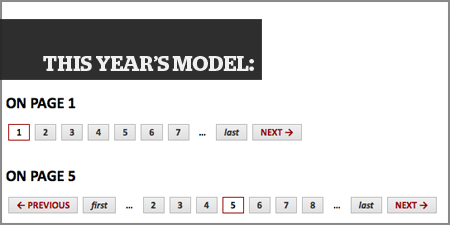
One iteration later, here’s what I’ve got:

What’s new?
- I swapped the background images for the normal and hover states — as well as the text colors. Now buttons “light up” and numbers turn red when you hover over them, inviting a click.
- I made the current page stand out from the rest with a red outline; plus, removing the textured background at the same time makes the button look flat and un‐clickable, as it should be.
- The “first” and “last” buttons were demoted, typographically speaking, and moved closer to the numeral range where they belong.
- Finally, “previous” and “next” are the attention‐grabbers. They’re always red, not just in the hover state, and they’ve got associated symbols: the dedicated left‐arrow and right‐arrow characters (numeric entities
←and→) are both beefier than the angle‐quotes and more semantically meaningful.
Here’s the HTML version so you can play with the hover states. The result probably needs some visual tweaking to look as polished as the original, but I’m quite satisfied with the usability gain.
The bullet points
Fine, fine, I’ll give you the Cliffs Notes version. Here’s how to paginate:
- “Next” and “previous” are the two most important buttons. Treat them that way. Make them easy to find and easy to click.
- Individual numbers must have a clickable area that is larger than the numeral itself. Give the links
display: blockand add some padding. And style the:hover
state so that the user can tell when he’s over the button. (Hell, you can style the:activestate for extra credit.) - Make the numerals large enough that they can be read easily. Get rid of the default underline for numeral links; it does more harm than good with such a small piece of text.
- Make sure the user knows what page he’s on and how many pages there are total.
- Angle quotes (») are abused. Don’t treat them like arrows. We have arrows (←) for that.
Pedant class dismissed.
Comments
This is great analysis. I will keep it in mind whenever I need to incorporate a pagination control.
Great article. I really hate poor pagination and those fucking left/right angle quotes being used as arrows is absurd when there’s are entity refs for proper arrows (which I see smattered all over this comments area). Worth a mention in the same paragraph is a similar use of greater/less-than’s.
Why does it feel like every web site nowadays was done by someone who just learned how to write markup?
What would really be nice is to have the “first” and “last” simply be the actual page number. “first” should always be “1” and “last” should be whatever number the last page is. If it’s 20 pages, say 20 pages. This gives you a clue to just how much information you might have to (want to?) sift through. Otherwise, I think you’re spot on.
Good writeup, Andrew. I like what you did, though I agree with Snook’s recommendation to nix last (& first) and use the page numbers so viewers have that sense of how much they’re looking at.
Yeah, the original version of this post took us through multiple iterations of the control, but I’m no Tolstoy and the thing was getting pretty long already.
This is where JavaScript can play a role, I think… a good solution is a slider that appears on demand and lets you select an arbitrary page. Maybe I’ll do a proof-of-concept in a future post.
I don’t know if this really applies to this discussion, but I always look for the “show all” option for everything… articles, online stores, photo galleries. Isn’t that the point of a fast internet connection… I don’t need things sent to me one at a time?
I hate the “Top 20” lists that show me the list one page at a time w/o a link to all of them. I don’t want to read everthing, or click 20 times to see the whole list. Show me everything and I’ll look for what I want, or at least give me previews/summaries/thumbnails to go through.
Like your analysis Andrew especially your point about the ‘last’ page.
@Jonathan: I think it really helps users to show them the amount of items available by hinting the last page.
@Hoon: I can feel your urge for the ‘show all’ option (and I personally set google results to 100) but in most cases it is not feasable to show all results, so 50 or 100 or user setting might be the way to go.
I’d like to share a write-up I’ve done some time ago (and appreciate comments): Design Guidelines: Pagination.